
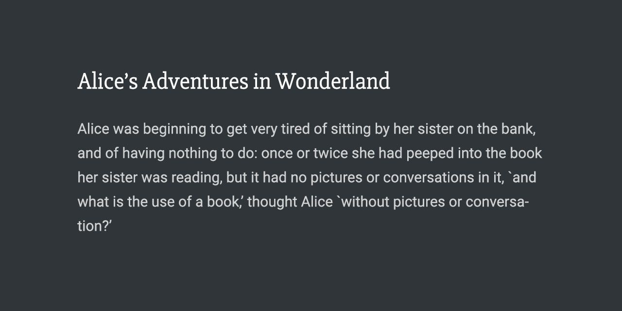
Typography is one of the most important elements of your website. As a minimum, your website needs to be clear and easily readable. Yet, typography also offers much more. The right font choices can enhance your brand while the wrong ones can undermine it.
In the beginning, websites were built using a handful of fonts called ‘Web Safe Fonts‘. Web Safe Fonts are a limited set of fonts that come pre-installed with operating systems, using these ensured your website’s text displayed consistently across all devices.
Then, in 2010 Google raised the bar on web typography by launching their Google Fonts collection. Their mission was clear:
“Making the web more beautiful, fast, and open through great typography”
https://fonts.google.com/about
With over 25 quadrillion views, it’s safe to say that has been achieved.
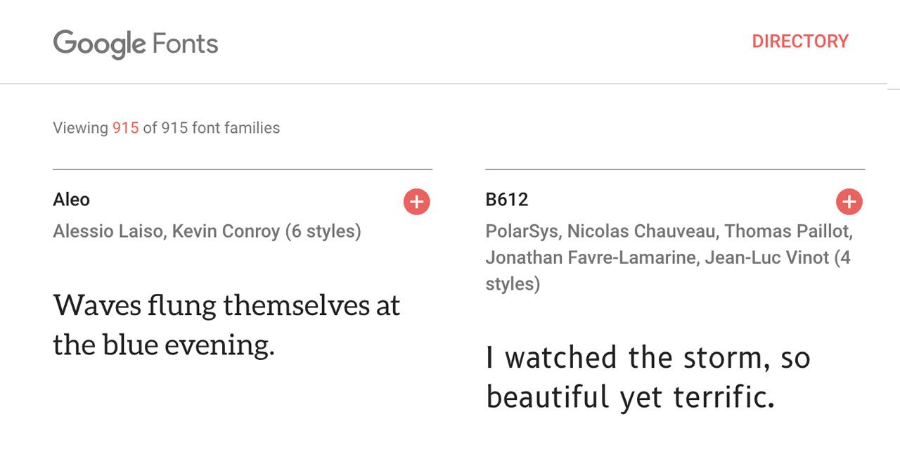
The Google Fonts collection contains more than 900 font families, with more being added on a regular basis. The fonts display correctly on all devices (including mobile) and are completely free to use for both personal and commercial use.
So you’re sold on using Google Fonts, how do we use them in WordPress? Thankfully, it’s super easy using a free plugin.
Note: It’s also possible to add Google Fonts using CSS, but it’s more technical.
The first step is to login to your WordPress admin area and navigate to Plugins → Add New.
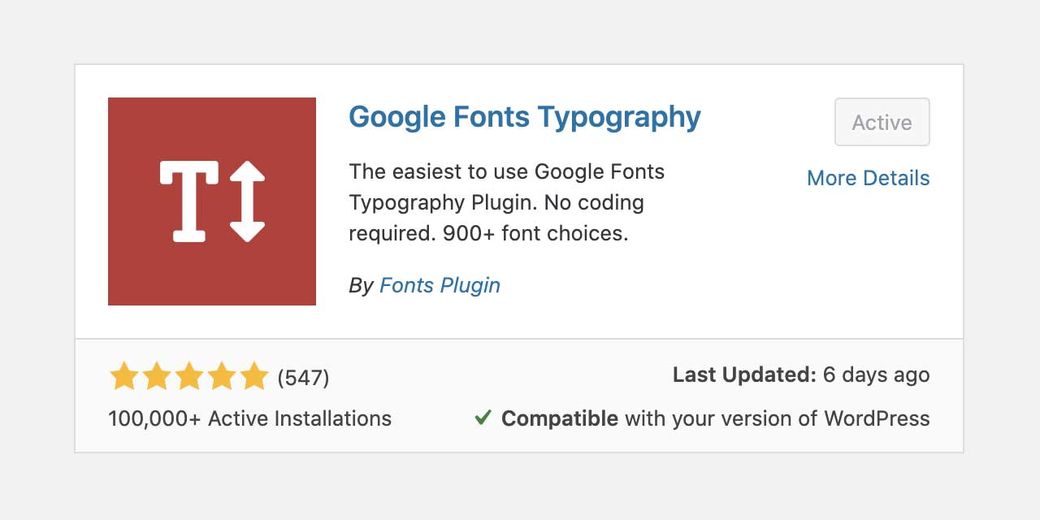
Now type “Fonts” or “Google Fonts”, the plugin we are searching for is named “Google Fonts Typography“. Click ‘Install Now’, then ‘Activate’.
The preliminary work is done, now we can start using the fonts. Navigate to Appearance → Customize and you will see a new tab in your Customizer named ‘Google Fonts’.
One of the great things about this plugin is that it’s split into two panels:
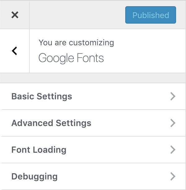
Basic Settings – Perfect for quickly adding one or two fonts across your whole website.
Advanced Settings – These allow you to customize each element of your site individually, some examples include Site Title, Site Description, Headings (H1 → H6), Sidebar Typography and Footer Typography.
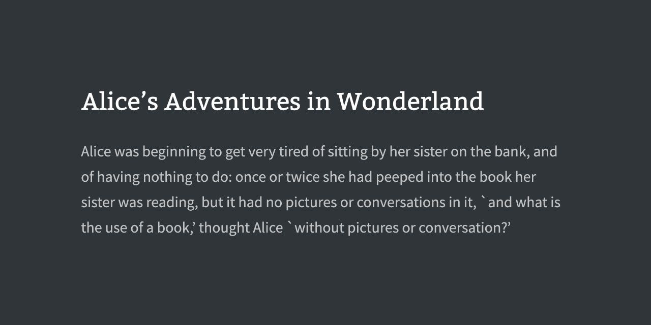
In this guide, we will be setting a single font for our headings, and one for content. We can do that without leaving the ‘Basic Settings’ panel.
At this point I recommend browsing fonts.google.com to give you some ideas of fonts you might use.
Now the fun part! Once you have some ideas, we can try them out and preview how they will look on your website.
Note: Your changes won’t be made live until you press ‘Publish’.
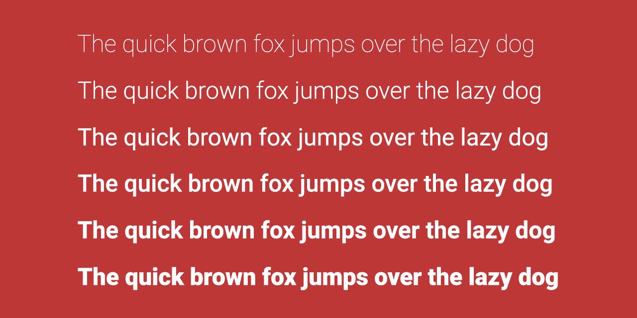
Some fonts only support a single ‘Font Weight’. While others, such as Roboto, support up to 6: Thin, Light, Normal, Medium, Bold, Extra Bold.
If you are using a single font across your entire website, it’s a good idea to choose one with various weights, a few examples include:
Font Pairings
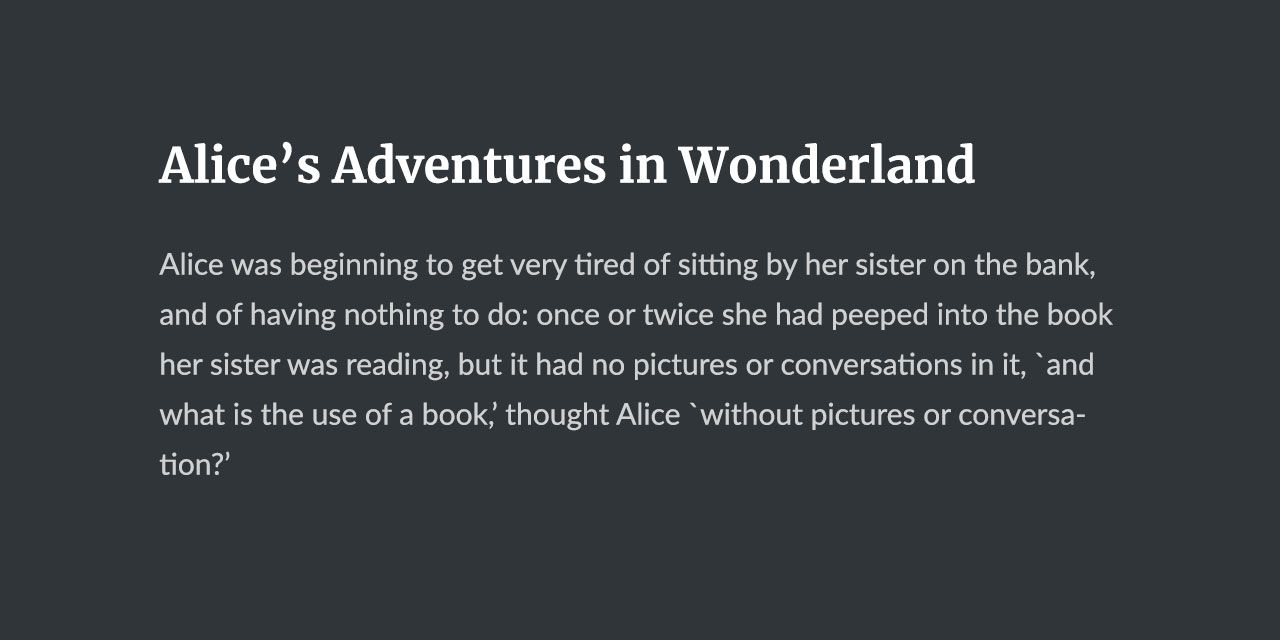
The most common approach is to use one font for headings, and another for body text. Doing this adds visual interest to your content. Some good font combinations are:
Slabo & Roboto
Merriweather & Lato
Bitter & Source Sans Pro
Tip: A good font pairing combines two fonts that aren’t too similar. For this reason choosing one serif and one sans-serif font works very well.
Optimizing Google Fonts
There is one downside to using Google Fonts, they are not installed on your visitor’s device. That means they need to be transferred from Google’s servers to your visitor’s device when they first load your website.
Web browsers implement techniques to ensure fonts are loaded in the most efficient way. One technique they use is to cache the files so they require less bandwidth on subsequent loads (even across different websites). But there are still things you can do to optimize your usage:
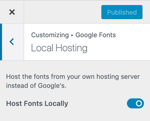
1. Host Google Fonts Locally
By hosting Google Fonts locally, you remove the need for the browser connect to Google’s servers. This removes one HTTP request and can also help with GDPR-compliance. Google Fonts Pro features a one-click toggle to enable Local Hosting:
2. Limit Font Families
With so many great choices, it’s tempting to use too many different fonts. My personal recommendation
3. Limit Font Weights
Open Sans includes 4 font weights: light, regular, bold and extra bold. Each weight carries some cost in terms of bandwidth. If you’re only going to use Open Sans for headings, which are always bold, it makes no sense to download the regular and extra bold weights.
Final Thoughts
Google Fonts is one of the best free resources available for adding character to your website. In this guide, we have looked at the easiest way to add them to WordPress. If you’re looking for extra inspiration, check out these excellent font combinations.