Finding great fonts can be incredibly difficult and often involves looking towards premium font foundries.
While font foundries such as Hoefler & Co. provide excellent fonts that are well-worth the cost, sometimes your project doesn’t necessitate the investment.
Fortunately, free serif fonts do exist and many of them are of a very high quality.
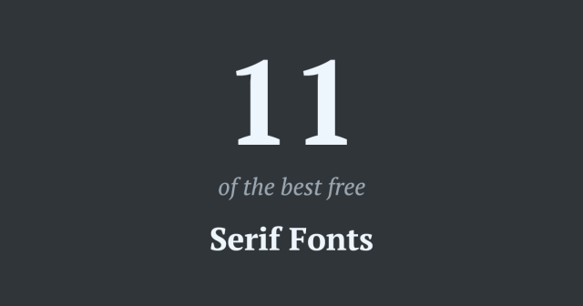
Here are 11 of our favourite serif fonts.
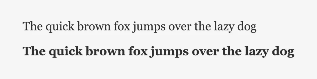
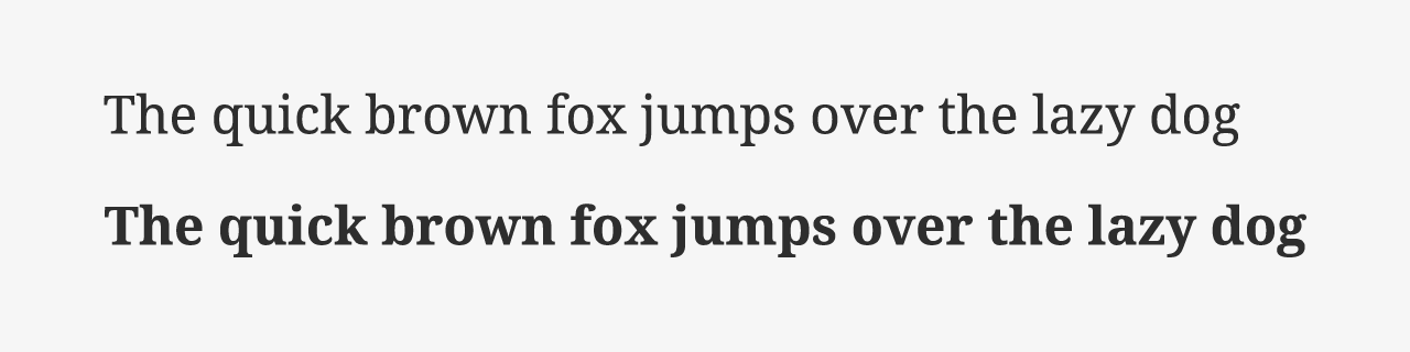
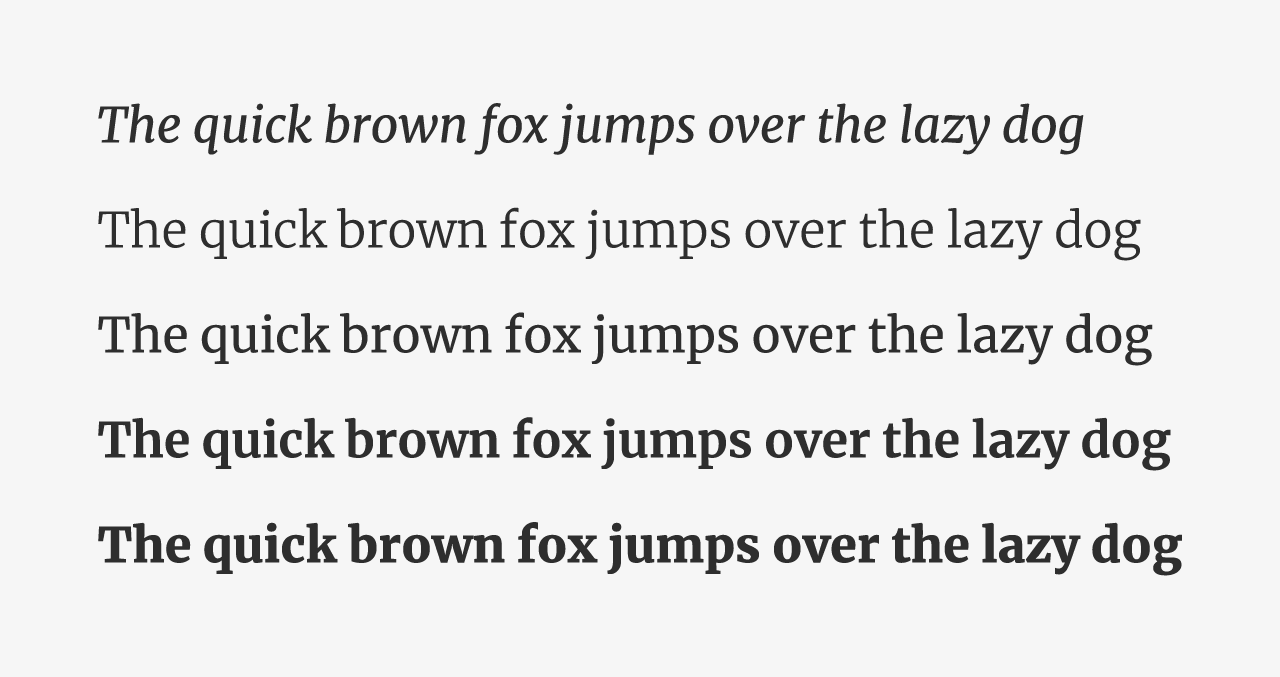
1. Georgia
Any list of serif fonts would be incomplete without Georgia. Released by Microsoft in 1996, the typeface was specifically designed for the low-resolution screens of the time.
Georgia is a system font that displays consistently across all operating systems. This has made it a staple for web designers over the past 20+ years.
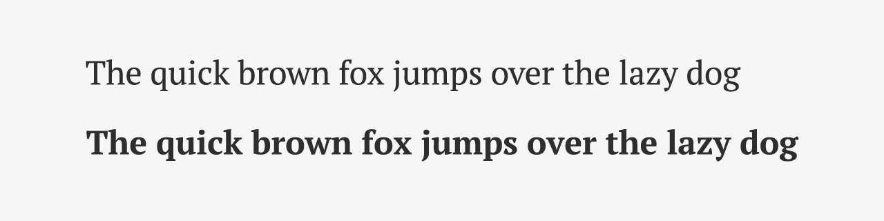
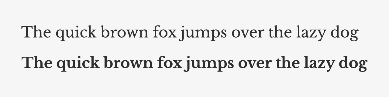
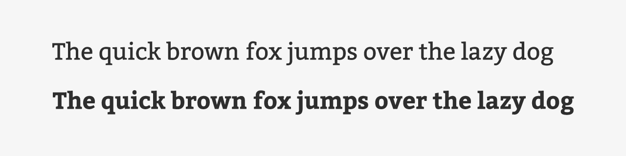
2. PT Serif
PT Serif is part of the larger PT Fonts collection. Its development was funded by the ‘Russian Federal Agency for Press and Mass Communications’ and dedicated to the 300 year anniversary of the civil type invented by Peter the Great in 1708–1710.
One of the most notable uses of the PT Serif font is the TIME website, which uses the typeface for its article content.
Entrepreneur.com, another top 500 website, also uses PT Serif for both headings and body content.
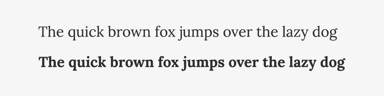
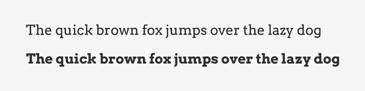
3. Lora
Lora is a modern serif font which works well for both headings and body content. Its contemporary appeal has been appreciated by the hip Urban Dictionary which uses the fonts for its headings.
4. Noto Serif
Noto Serif (and its sister font “Noto Sans”) were designed with a goal in mind, to make the font visually harmonious across all languages.
The Google team have made great progress on their aim, the Noto Serif font has coverage for 237 regions and almost 600 languages.
Notable sites using Noto Serif include the NFL, Washington Press, and Inquirer.net
5. Libre Baskerville
Libre Baskerville is an evolution of the original Baskerville font. Unlike its predecessor, Libre Baskerville is optimized for the web rather than print.
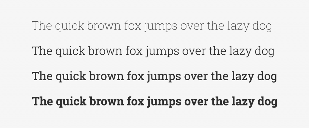
6. Vollkorn
Vollkorn is a strong font that comes in a range of weights, which makes it perfect for headings or body content.
Friedrich Althausen, the designer, describes Vollkorn as a “healthy typeface”. When translated from German, Vollkorn means ‘wholegrain’. Surprisingly, Vollkorn was the first Althausen’s ever released (2005).
7. Roboto Slab
The Roboto font family is a modern typeface collection developed by Google in 2011 and used in their mobile operating system Android. Fortunately for us, they released the entire work under a Libre license.
Slab fonts have a strong and stable aesthetic. It’s been used to good effect on the WWE website, where Roboto Slab is the chosen typeface for article content.
Boy Scouts of America is another fantastic example, who use the font for headings.
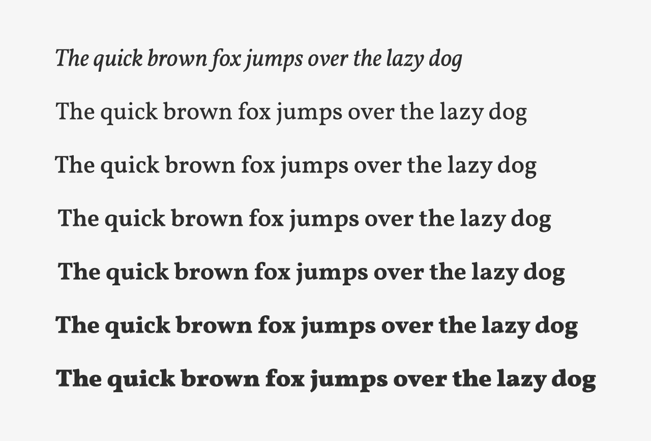
8. Merriweather
Merriweather is an excellent font choice for body text. Its large x-height makes it very readable. It also features all the variants you might need in your content:
- Light and Light Italic
- Regular and Regular Italic
- Bold and Bold Italic
- Black and Black Italic

9. Slabo 27px
Slabo 27px is an interesting font. Unlike the other fonts in this list, it’s only designed to be displayed at one size and one weight: 27px regular.
The unique design of this typeface makes it an appealing choice even with the restrictions it imposes.
Of course, you don’t need to strictly adhere to the 27px font-size. The Yes Network website, for example, displays the font at 24px and it still looks great.
10. Bitter
Bitter has an above-average stroke width which makes it a better choice for headings rather than body text.
The unique curves give the typeface a soft playful feel, while still retaining the professional aesthetic that slab serif fonts offer.
The careers page of MyHeritage is a great example of Bitter in-use.
11. Arvo
Arvo features very straight, square strokes. The absence of curves gives this typeface a professional look when compared to the softer Bitter typeface.
Arvo shines when used a heading font, as can be seen on the NAEYC website.