Gotham is a broad, geometric sans-serif typeface. Designed by Tobias Frere-Jones and originally commissioned for GQ magazine, Gotham is heavily inspired by the streets of New York.
“I suppose there’s a hidden personal agenda in the design, to preserve those old pieces of New York that could be wiped out before they’re appreciated. Having grown up here, I was always fond of the ‘old’ New York and its lettering.”
Tobias Frere-Jones
Gotham is widely visible across the web. Over 8000 of the top one million websites use the font, including upwork.com and QVC.com.
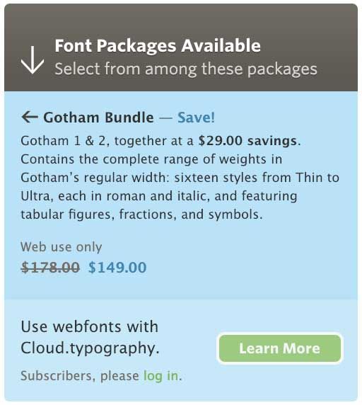
Gotham is part of Hoefler & Co’s typography bundle and can be used on your website from $99/year (250,000 page views per month).
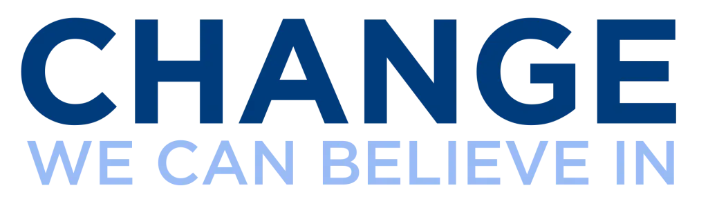
In 2008 Gotham was used in the Obama campaign. Then years later a custom serif version of Gotham was created for Obama’s 2012 campaign too.
Google Fonts Alternatives
Gotham is undeniably a unique font with a lot of character, which makes it hard to find a close match in Google Fonts. Here’s what I’ve found so far:
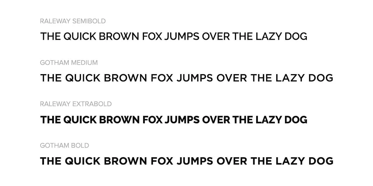
Raleway
Raleway is the most similar font to Gotham in the Google Fonts directory. Raleway was originally designed by Matt McInerney in a single weight – thin. It was then expanded to include 9 weights by Pablo Impallari and Rodrigo Fuenzalida in 2012.
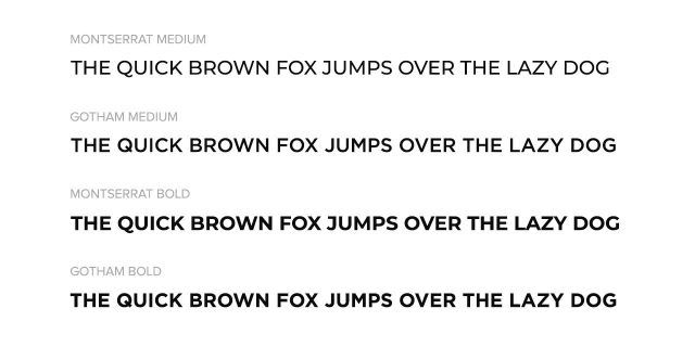
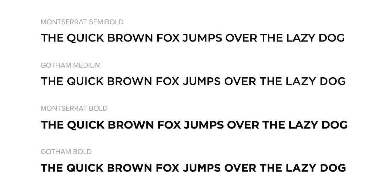
Montserrat
While Montserrat is often touted as a Gotham alternative, there are significant differences – the tail on the Q is the most noticeable.
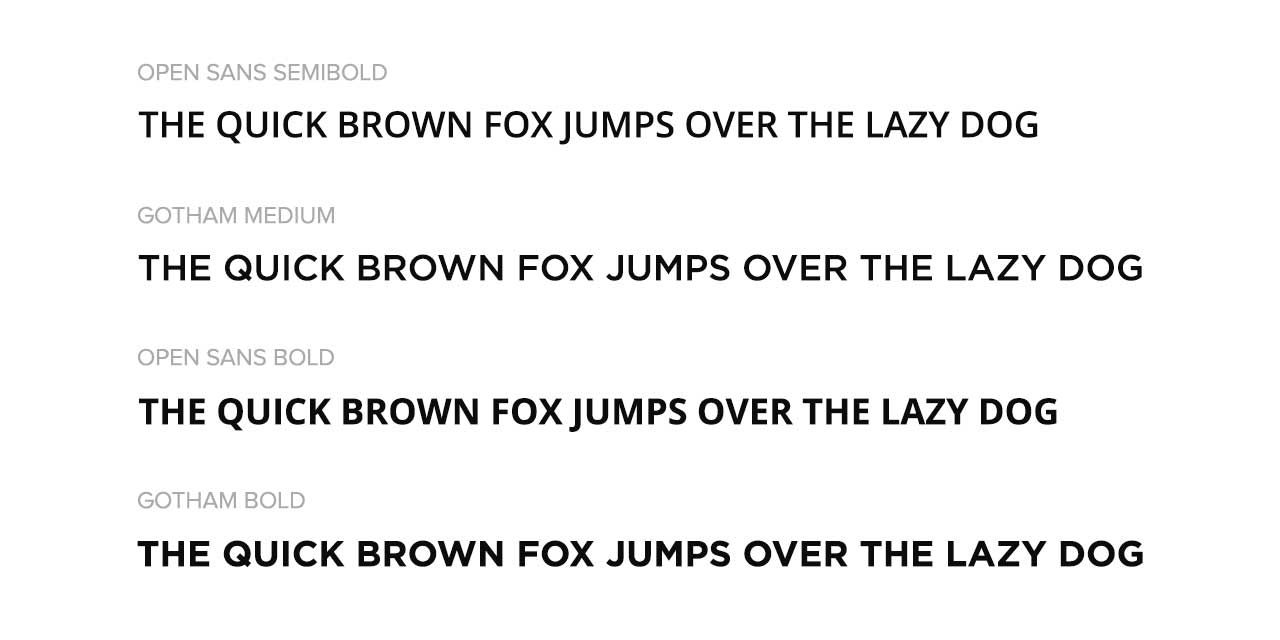
Open Sans
Open Sans does have similarities to Gotham, but right away you will notice the Q and E are a significant departure.