Google Fonts Similar to Helvetica Neue

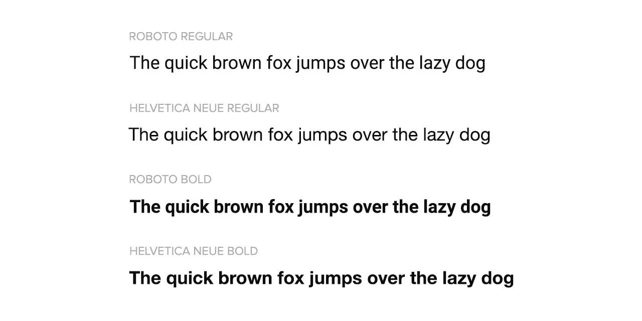
If you’ve held an iPhone then you’ve probably seen Helvetica Neue. It was the system font of iOS from inception up until 2015, when they replaced it with their own custom font, San Francisco.

Helvetica has proven to an extremely popular typeface for big brand logos. Some notable examples include Jeep, Verizon and American Apparel.

Jeep, Verizon and American Apparel Logos in Helvetica Neue
Famous Examples of Helvetica Neue

Helvetica Nueu is the second most popular font used on websites. It’s currently used on over a quarter of the top million websites. It’s only beaten by Arial, which 60% of websites use.

Origins

Helvetica was released in 1957 and designed by Max Miedinger. For the first three years of it’s life it was named “Neue Haas Grotesk”. Then in 1960 they changed the name to make it more marketable. The change must have worked as it’s been one of the most used fonts ever since!

In 1983 a design foundry named D. Stempel AG redesigned Helvetica and gave it a new name.

The new name was Neue Helvetica. It makes perfect sense as “Neue” is the german word for “new”. It’s more common to see it called “Helvetica Neue” nowadays.

Neue Helvetica refined Helvetica rather than completely redesigning the classic typeface. The changes focused on increasing consistency between characters and improved spacing in the numbers.

Using Helvetica Neue On Your Website

Helvetica Neue is a system font of macOS. Which means you can define it in your CSS without loading any additional files or scripts:

body {
    font-family: Helvetica Neue;
}

But, Helvetica Neue isn’t installed on Windows or Linux, which together have 90% of the market share. So you need a fallback font:

body {
    font-family: Helvetica Neue, Arial, sans-serif;
}

CSS reads left to right, if Helvetica Neue isn’t available, it will try Arial (which is available on both Windows and macOS), if that fails it will resort to a sans-serif default.

Google Font Alternatives

The problem with the fallback method is that you can’t create a consistent experience across devices. Some of your users are seeing Helvetica Neue, some are seeing Arial.

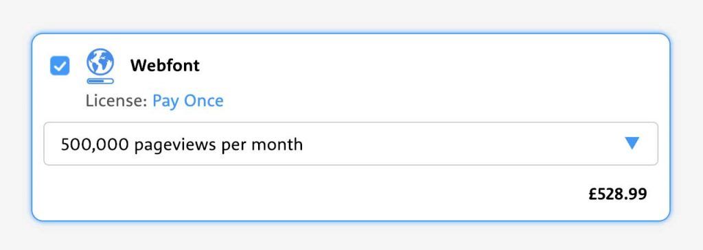
One solution is to purchase a webfont license for Helvetica Neue, this allows you to embed the font onto your website, and works across all browsers. This comes with one major downside, cost. A “Pay As You Go” license costs $400 per 250,000 pageviews.

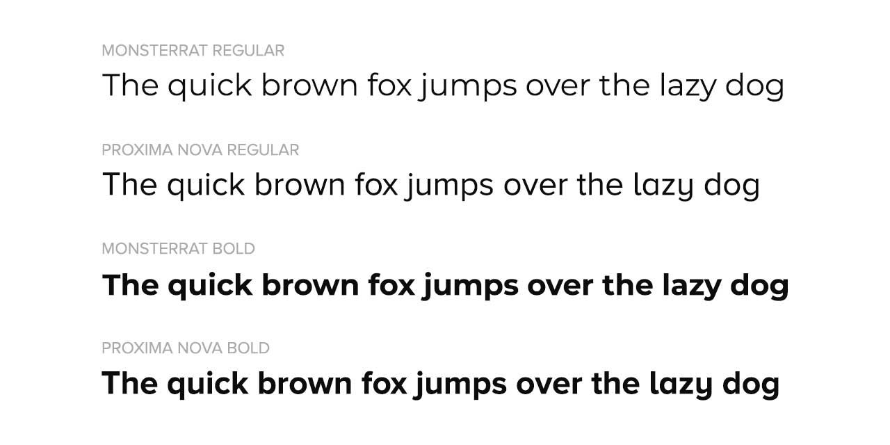
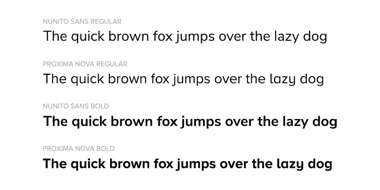
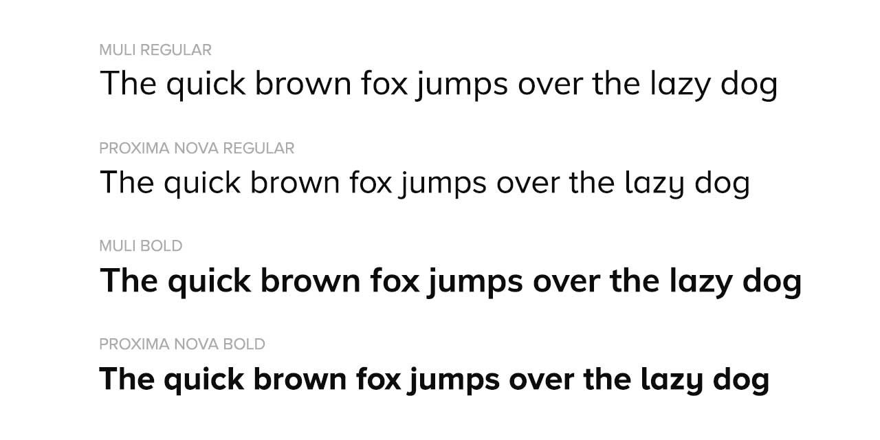
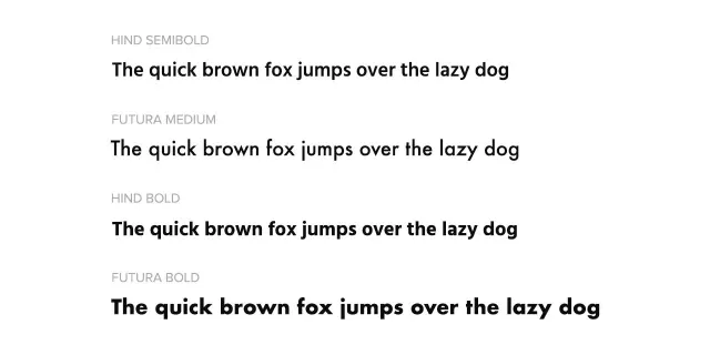
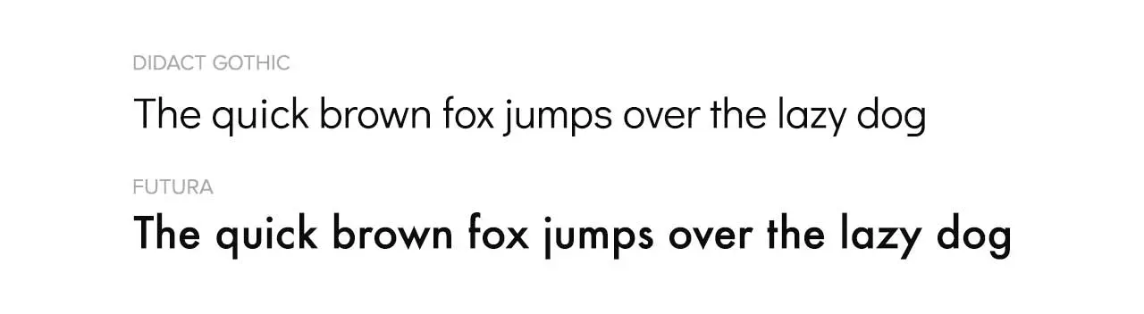
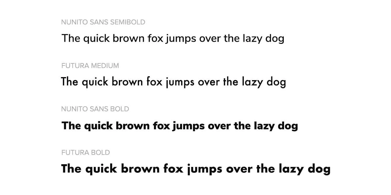
Using Google Fonts is an alternative solution that is free and works across all browsers, here are some similar fonts I’ve found:
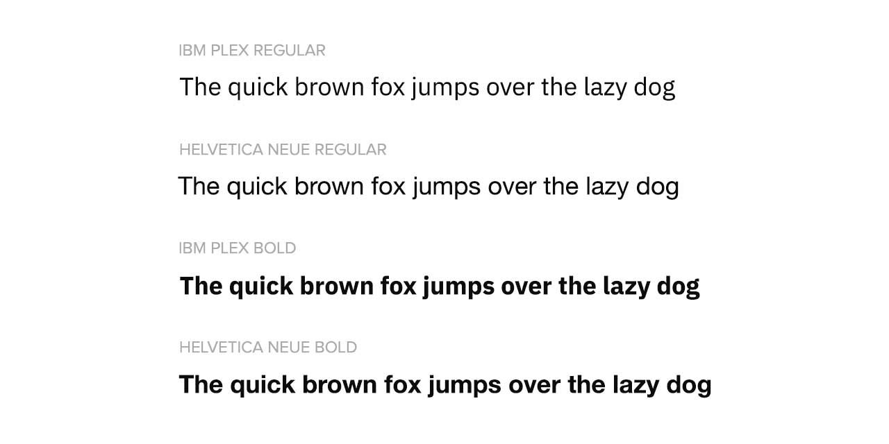
IBM PLEX

IBM were spending in excess of one million dollars a year licensing Helvetica, then after fifty years they decided to commission their own typeface.

“When I came to IBM, it was a big discussion: Why does IBM not have a bespoke typeface? Why are we still clinging to Helvetica?”

Mike Abbink, Executive Creative Director at IBM

Their new typeface is called IBM Plex, the design and development was lead by Mike Abbink. Thankfully for us, IBM decided to release it for free with no restrictions.
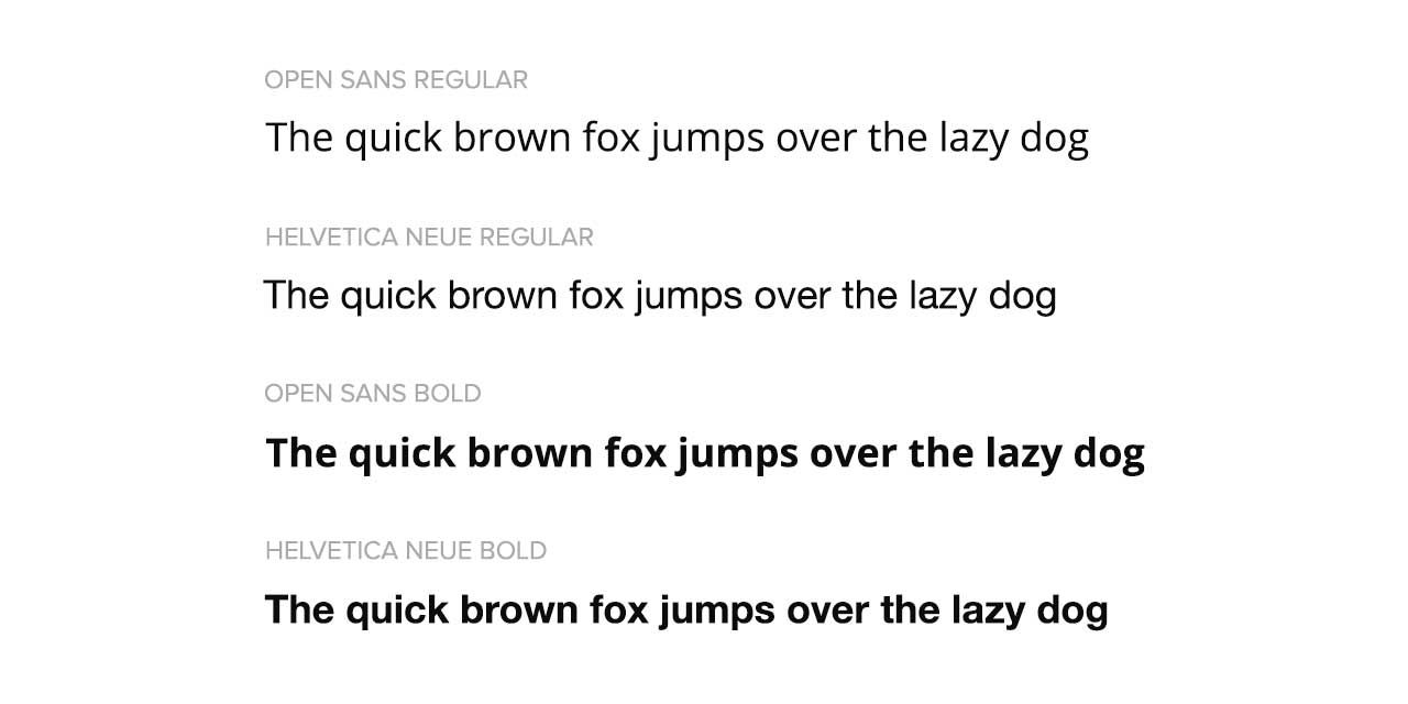
IBM Plex Compared to Helvetica Neue
IBM Plex Comparison

Open Sans

Steve Matteson, a true veteran of the industry has designed fonts for Android, Microsoft and Google. With Open Sans he has created a truly versatile typeface that works well for web, mobile interfaces and print.
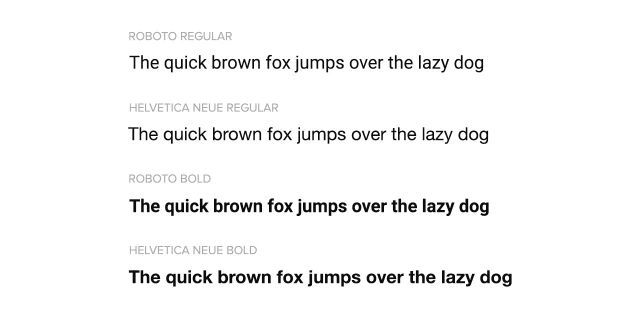
Open Sans Compared to Helvetica Neue
Open Sans Comparison

Roboto

Roboto has a very natural, easy to read, aesthetic. It was designed by Christian Robertson and features six weights: Thin, Light, Italic, Regular, Medium, Bold and Black. According it Google it’s extremely popular – currently being used on over 20,000,000 websites.

Roboto Compared to Helvetica Neue
Roboto Comparison

Google Fonts Similar to Proxima Nova

Proxima Nova is one of the most beautiful and popular fonts on the market. Unfortunately it’s expensive too. A Webfont license which allows you to use it on your website comes with a $500+ price tag.

source: https://www.myfonts.com/font/marksimonson/proxima-nova

In this article we are going to look at the origins of Proxima Nova and also some similar fonts from Google that are completely free to use.

Origins

Proxima Nova was launched in 2005 by designer Mark Simonson. It’s used by over 30,000 of the top one million websites and it features 8 weights:

  • Thin
  • Light
  • Regular
  • Medium
  • Semi Bold
  • Bold
  • Extra Bold
  • Black

Mark had worked on Proxima Nova since 1981. Initially the typeface was called Zanzibar. In 1994 the typeface was updated and released as Proxima Sans before ultimately being expanded and re-released in 2005 as the Proxima Sans we know today.

Google Fonts Alternatives

While Proxima Sans might be outside the initial budget of your project, the following free options from Google Fonts provide a great alternative. You might even prefer them!

Montserrat

Named after the Montserrat, the oldest neighbourhood in Buenos Aires. This font by Julieta Ulanovsky was inspired by signs and posters from the neighbourhood.

Google Fonts Montserrat Comparison
Montserrat Comparison

Nunito Sans

Based on the Nunito Font by Vernon Adams, Nunito Sans is a non-rounded version of it’s predecessor.

Google Fonts Nunito Sans Comparison
Nunito Sans Comparison

Muli

Our last font is also by Vernon Adams. Sadly Vernon passed away in 2014, however his work does live on. In fact his fonts are in use on millions of websites and have accumulated billions of views.

Google Fonts Muli Comparison
Muli Comparison

Google Fonts Similar to Futura

Futura is the oldest font we’ve covered, designed all the way back in 1927 by Paul Renner. Since then it has been used by a range of big brands, in both logos and marketing materials

One of the most recognizable uses of Futura is the Supreme logo. A simple, but memorable red background and the brand name overlaid in Futura Bold Italic.

Supreme Logo
Supreme Logo

Futura comes pre-installed with macOS as a system font. That means if you simply defined the font in your CSS, even without any additional font loaders or scripts, it would display perfectly on Apple products.

Unfortunately for Apple, macOS has less than 10% market share. Which means the rest of your visitors would see something other than Futura.

There are different services you can use to ensure Futura displays consistently across operating systems. There is however a cost associated with those services – around $25 a month.

Google Fonts Alternatives

To avoid the costs associated with using Futura, here are three great alternatives from Google Fonts that are completely free to use, both for personal and commercial applications.

Didact Gothic

According to its designer, each character in the Didact Gothic Font represents the form it’s most commonly shown in elementary schools. Didact is very similar to Futura – but unfortunately it only comes in one weight: regular.

Didact Gothic Comparison with Futura
Didact Gothic Comparison

Nunito Sans

Originally designed by Vernon Adams, then later expanded to include more weights by Jacques Le Bailly. One key difference between Nunito Sans and Futura is the tail on ‘j’.

Nunito Sans Comparison with Futura
Nunito Sans Comparison

Hind

Hind is a clear cut font specifically designed for user interfaces. The flat endings on each character share similarities with Futura. Hind features five weights: Light, Regular, Medium, Semibold, Bold.

Hind Comparison with Futura
Hind Sans Comparison